Design System Case Study: Select Menu Item
Medallia
Problem
The current Select Menu Item component was not scalable or accessible. It also did not reflect the internal Design System website that Engineer’s referenced for code which made designing and coding for this component challenging and time consuming for both Product Designers and Engineers.
Results
The new Select Menu Item allows designers to create versatile rows for their dropdown menus in the Select Menu and Select Menu Hierarchy components. These dropdown menus are frequently used with Multi-Select, Select Stacked, Select Inline and Single Select components. As seen below. These components make up a larger majority of our Medallia platform. Therefore, making this a robust master component that creates efficiency and reduces design and programing time for both Product Designers and Engineers.
My Role
Visual Design, User Interface, Accessibility and Design Strategy
Target Audience
Product Designers, Engineers, and Product Managers

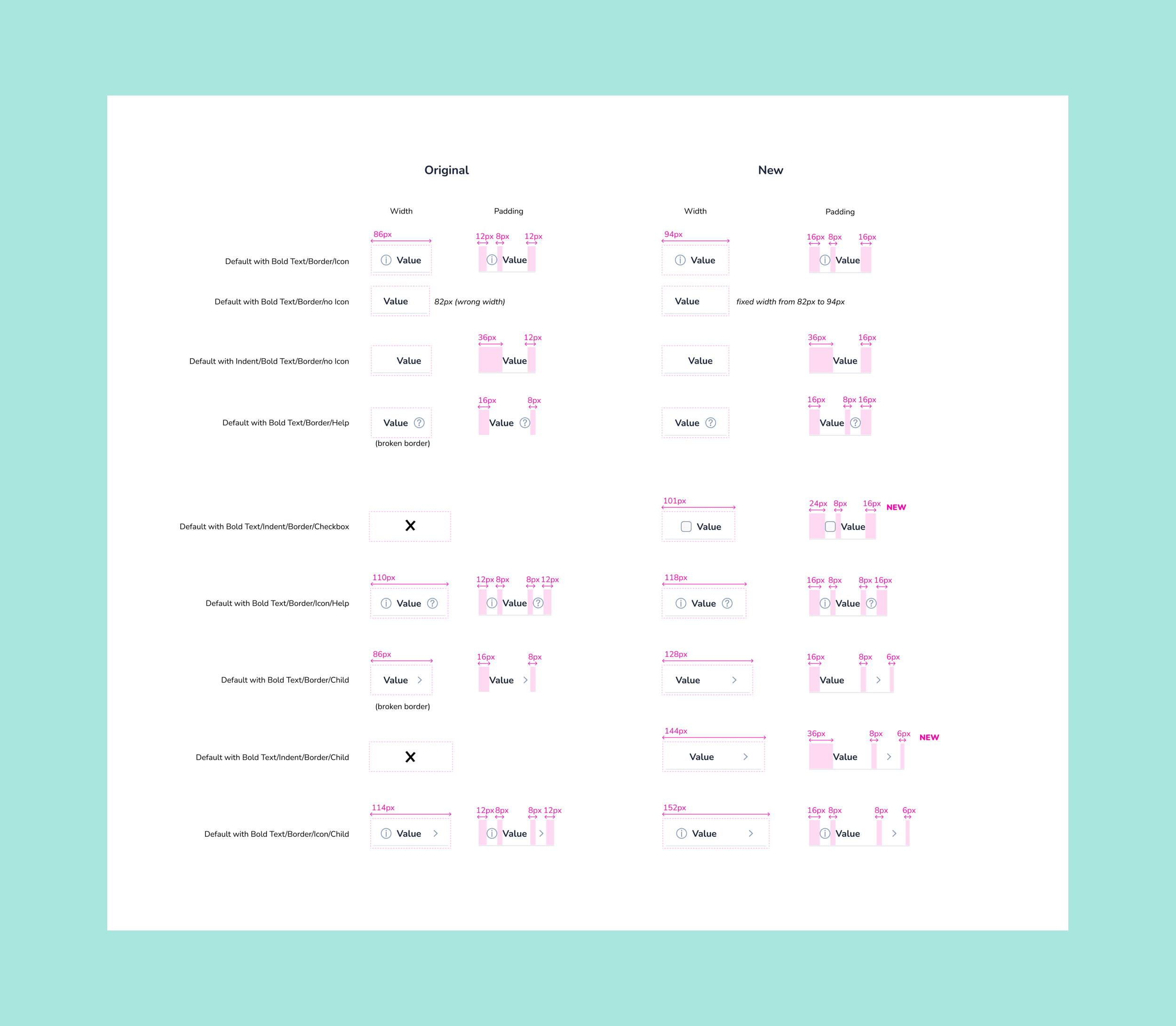
Improving the width and padding
To create consistency and accommodate for the new properties, variants and states being added, I changed the base width and padding of the 7 current components.
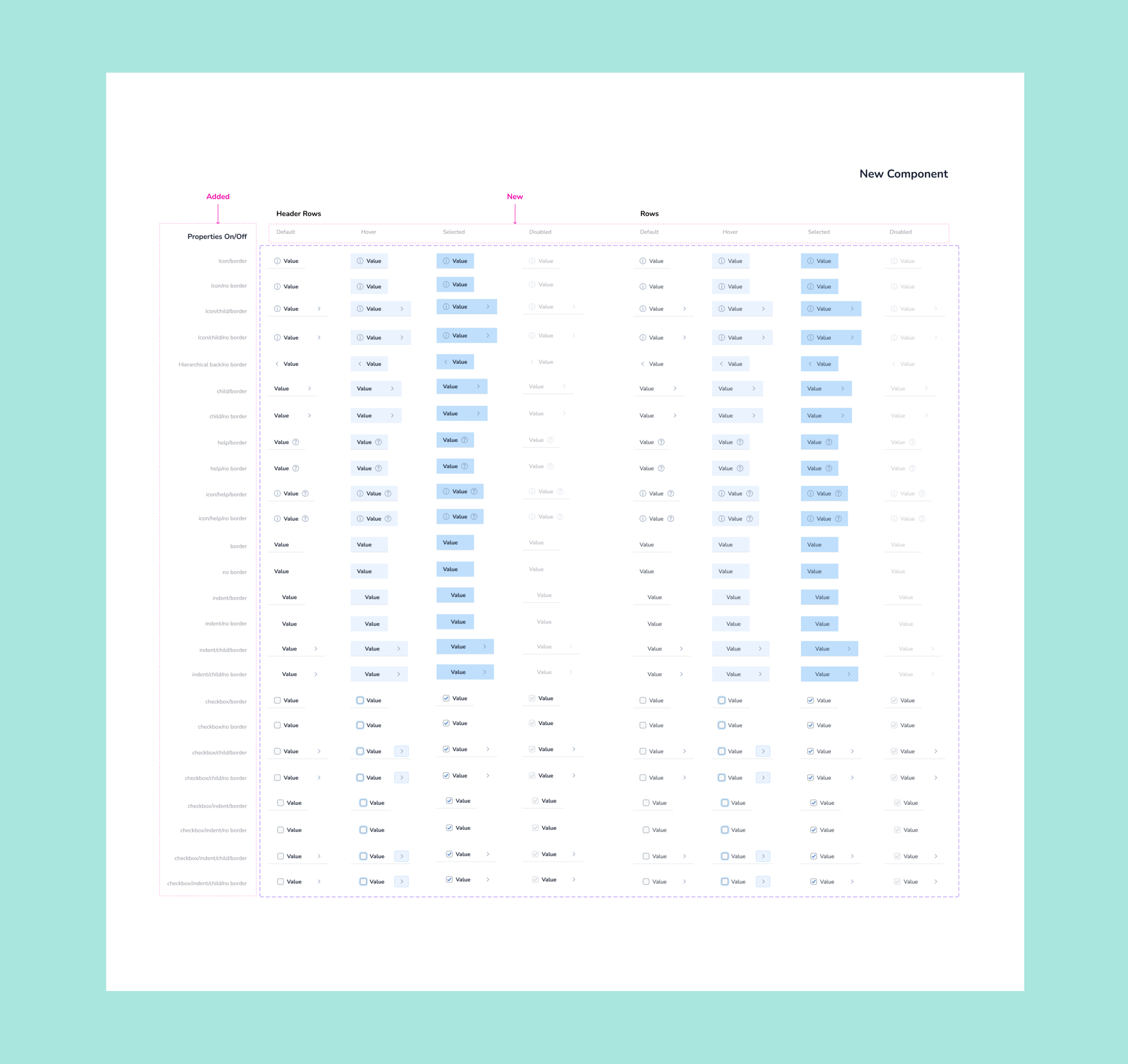
New properties, variants and states
To create a robust and versatile master component I added 11 new variants, 80 new states and 2 new properties to the Select Menu Item component. The properties includes a Hierarchical back row and a Checkbox row with an accessible focus hover state making it 2.2 compliant.

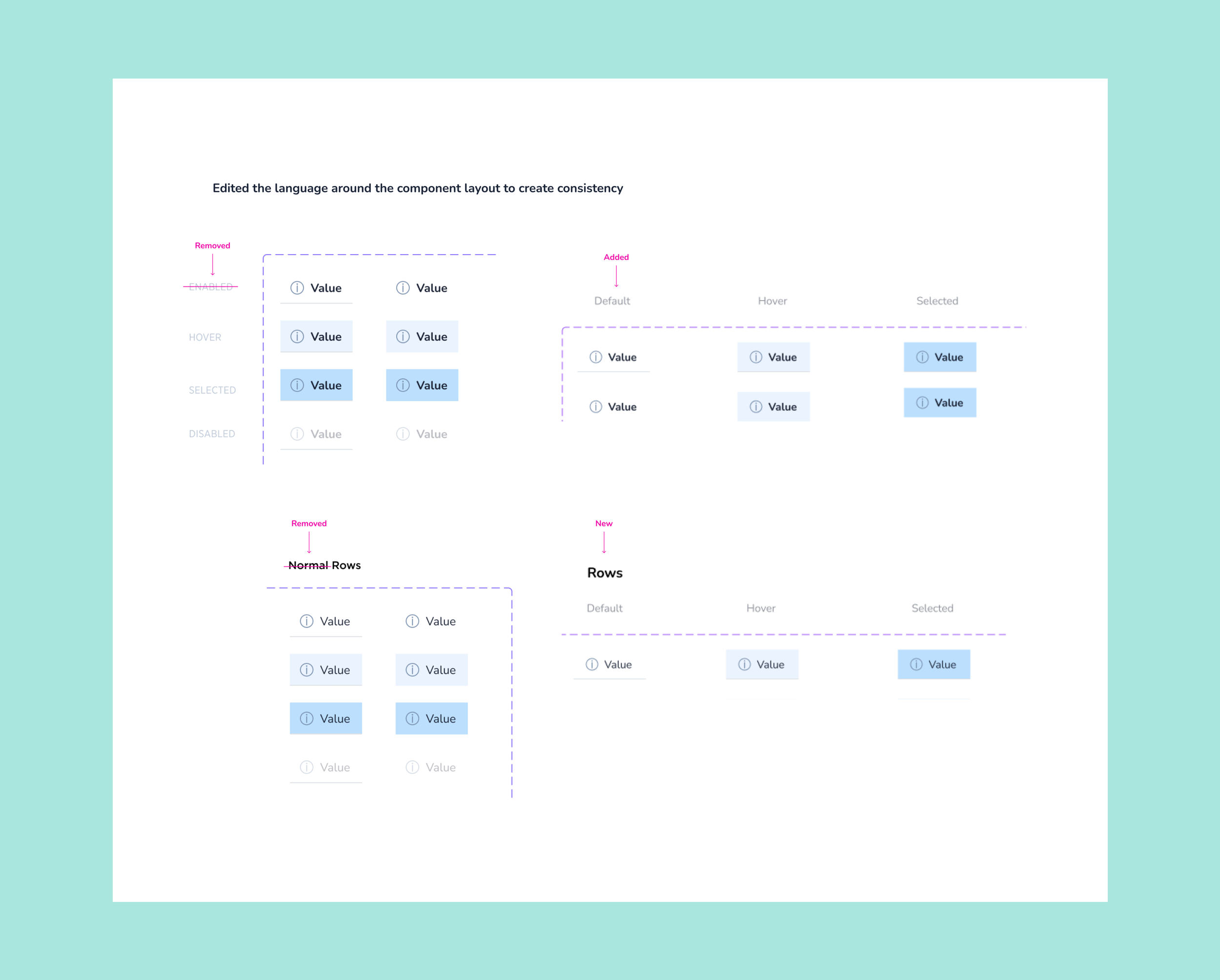
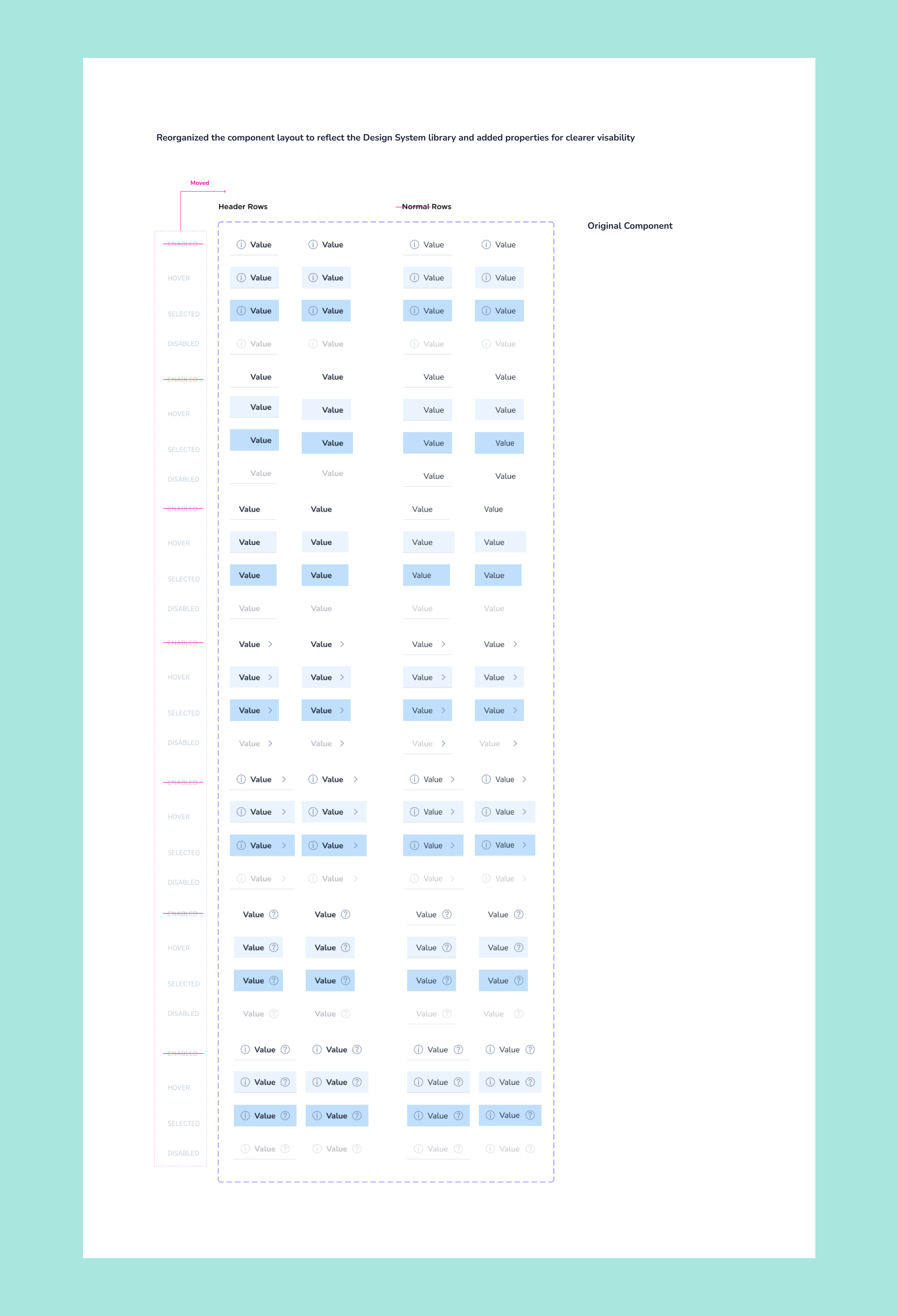
Reorganizing the component layout
To create a more efficient user flow I reorganized the layout of the new Select Menu Item component. I edited the language for “Enabled” state to “Default” state and removed the word “Normal” from “Rows” to create consistent language that reflects the current Design System Library. I also added all the properties to showcase the versatility of the new Select Menu Item component.