
Scaling a Design System: 20 Components in 12 Months
Medallia
Problem
The existing design system at Medallia needed significant evolution to meet the demands of growing product teams. Many components required Figma updates to improve accessibility, interaction logic, and alignment with system tokens. Additionally, key UI patterns were missing entirely, requiring the creation of net-new components to support modern product workflows. I was responsible for improving legacy components and designing scalable, accessible, and flexible new patterns to meet team and platform needs.
Results
Over the course of 12 months, I contributed to the evolution of 20 components: 12 improvements and 8 net-new designs. These updates helped standardize visual logic across platforms, increase design system adoption, and improve accessibility compliance. Through thoughtful documentation and collaboration with developers, we reduced inconsistencies and created reusable patterns that scaled efficiently across product teams.
My Role
Design System Strategy, UI/UX Design, Figma Component Architecture, Accessibility, Documentation
Target Audience
Internal product designers and engineers across multiple Medallia teams using the web design system.

Featured Deep Dive: Select Menu Ecosystem
I led the refinement and expansion of Medallia’s Select Menu system by improving foundational patterns and building flexible, reusable structures across five interconnected components. At the core of this system is the Select Menu Item, which powers multiple menu variations through nested properties and state logic. These improvements supported more accessible, maintainable, and scalable patterns across the design system.
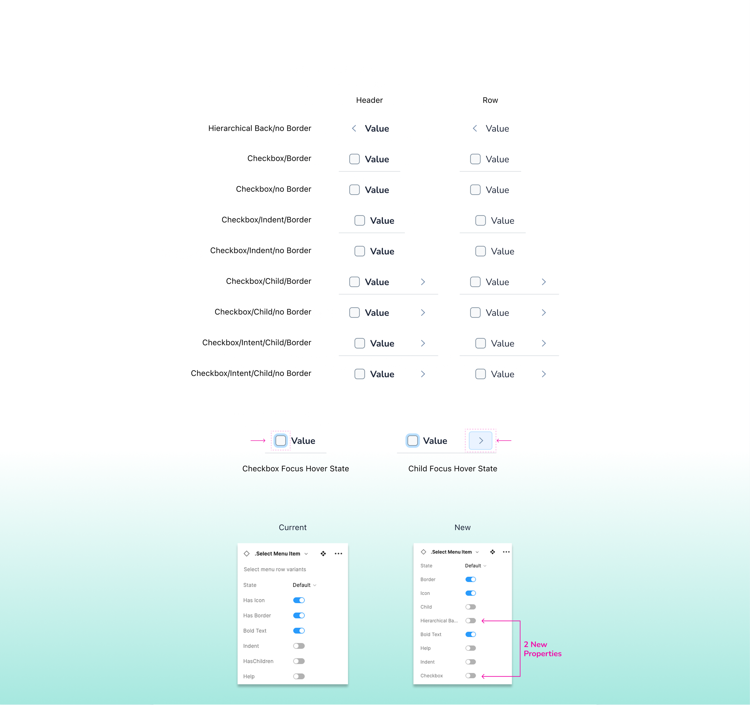
Select Menu Item (Improved Component)
Expanded the component to support 25 properties, with 18 newly added to accommodate complex use cases across multiple menu types.
Introduced new variants for hierarchy levels, borders, checkboxes, indentation, and nested child items, enabling designers to construct consistent and scalable menu structures.
Added hover and focus states for all checkbox and child arrow interactions, improving visual affordance and alignment with accessibility guidelines.
Structured the component using nested and grouped properties in Figma, allowing for a more modular and maintainable design experience while reducing file bloat and simplifying updates.
Designed for flexibility and system alignment, allowing this component to serve as a foundation for diverse menu patterns while maintaining consistency across use cases.
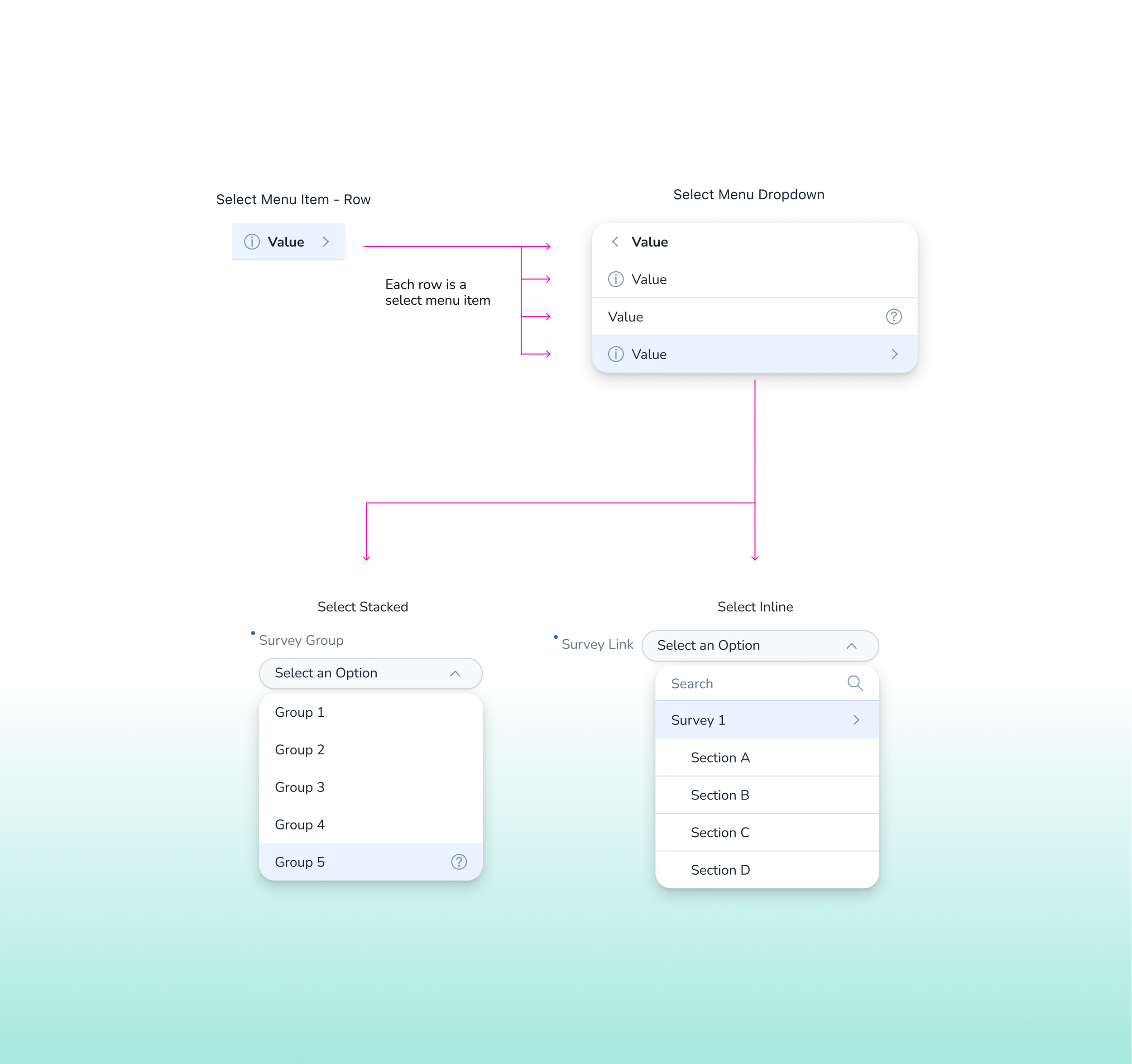
Select Menu Dropdown (Improved) with Select Stacked & Select Inline Menus (Net New)
Refined the core Select Menu Dropdown structure using the updated Select Menu Item component, allowing for scalable and consistent row logic across dropdown configurations.
Supported four layout variants (search bar on/off, scrollbar on/off), designed to flex based on use case complexity while maintaining visual consistency and accessible interaction behavior.
Introduced the Select Stacked Menu pattern for dense layouts requiring vertical field alignment. Built on top of the dropdown logic, this variation preserved full interaction states while aligning to responsive spacing tokens.
Created the Select Inline Menu pattern for compact UI contexts (such as toolbars and embedded filters), aligning the label, value, and trigger into a horizontal arrangement while reusing the same dropdown menu logic.
Ensured consistency across all three components through shared interaction states, spacing logic, and nested Figma properties—making the system easier to maintain and extend.
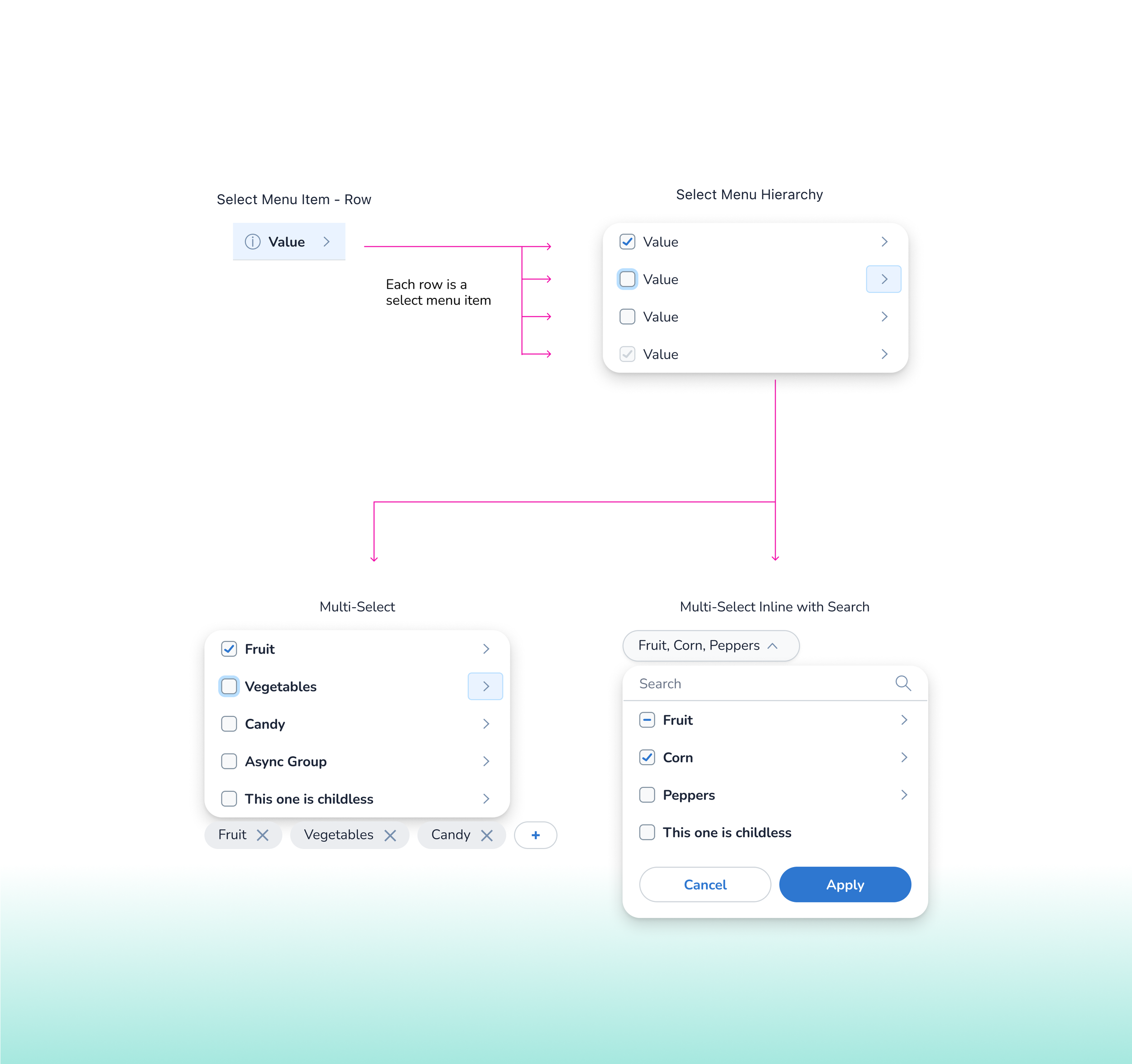
Select Menu Hierarchy (Improved) with Multi-Select & Multi-Select Inline with Search (Improved)
Rebuilt the Select Menu Hierarchy using the enhanced Select Menu Item component, enabling multi-level nested logic with consistent checkbox, indentation, and child arrow behavior.
Supported visual variants including combinations of border/no border, indent/no indent, and child/childless options to adapt to varied information architectures.
Integrated layout configurations with and without search bars and action buttons (e.g., Apply/Cancel) to support both simple and advanced workflows.
Extended this structure to power Multi-Select and Multi-Select Inline with Search, combining nested checkbox logic with tagging interactions for grouped selections and async category support.
Maintained consistent interaction patterns, spacing tokens, and Figma structure across all variations—making the system easy to scale, update, and implement across teams.
“This work shaped the foundation of a more scalable and accessible design system at Medallia, and sharpened my ability to think holistically across tokens, structure, and collaborative handoff. I contributed to a system that could adapt, evolve, and grow with the teams it was built to support. ”
— Reflections